Reinventing the 'save for later' experience
From design dash to beta: How we solved for one of mobile shopping's greatest frustrations
using one idea to solve for another
Carted’s proprietary ecommerce API and infrastructure had been exposed to shoppers via business customers, which meant we received a plethora of anecdotal feedback through the lens of our business customers, many of which weren't ecommerce-first businesses.
This meant that often we didn't get crucial feedback on our product from those who use it, which was a critical issue.
Having read about how Google utilised reCAPTCHA technology to train their AI models – providing a service that users want to aid another – it gave me an idea:
Could we build a consumer-facing product using our API in order to test the robustness of the service and get the crucial feedback we needed to grow the company?
There was some reluctance from the executive team to pursue something like this, with the understandable view that all attention should be focused on making it directly better for business customers, so I suggested to time-box the experiment by working as a team to create a solution in a design dash — an abridged version Google Venture's Design Sprint methodology.
Once we had decided on the principle of the idea, I got into the necessary discovery work.
Discovery
Through exploratory research interviewing people who matched a protopersona the team had devised, I identified a key issue with shoppers:
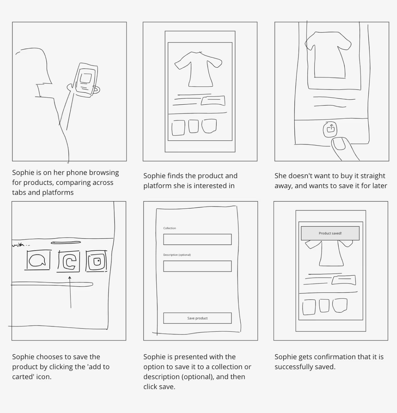
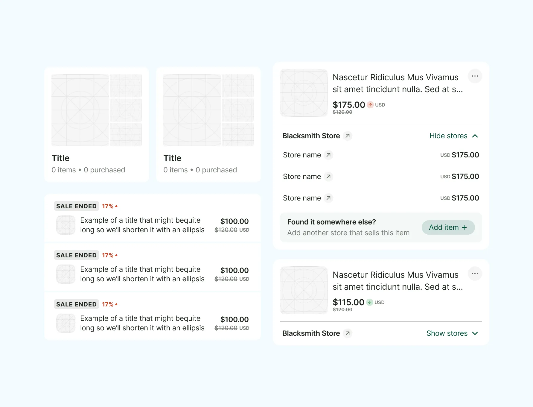
The current methods for saving items for later purchase are fragmented and inconvenient.
Shoppers on mobile commonly use screenshots or keep multiple tabs open as makeshift solutions. While some merchants offer wish lists, these often suffer from limited functionality, poor user experience, and the inability to manage items from multiple merchants in a single list.
the design dash
Ahead of the design dash, I created a persona based on my research findings, and generated a HMW question:
"How might we allow a shopper to save products they discover for later?"
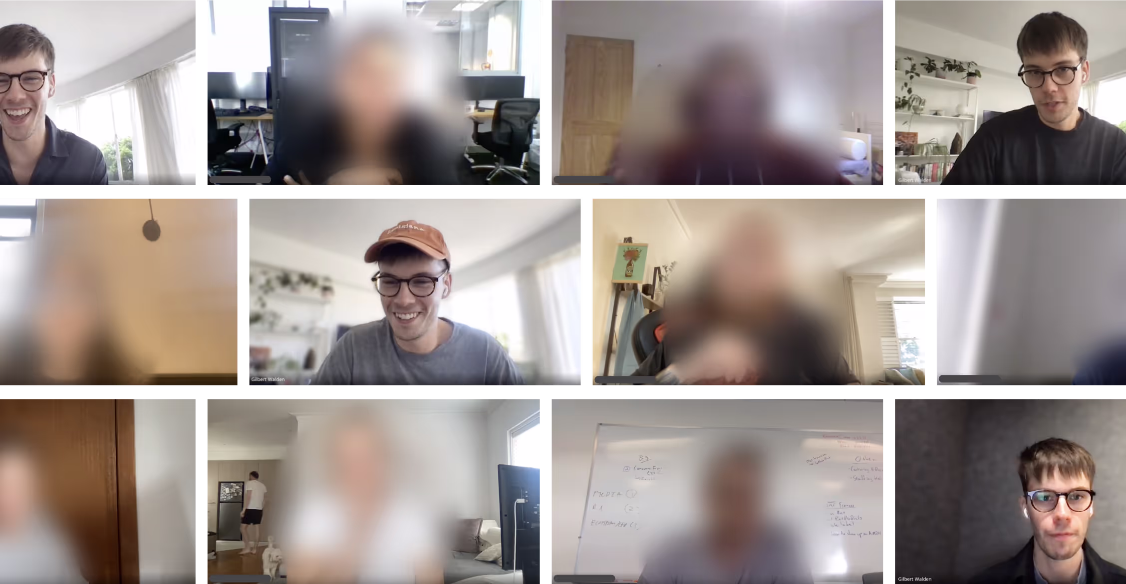
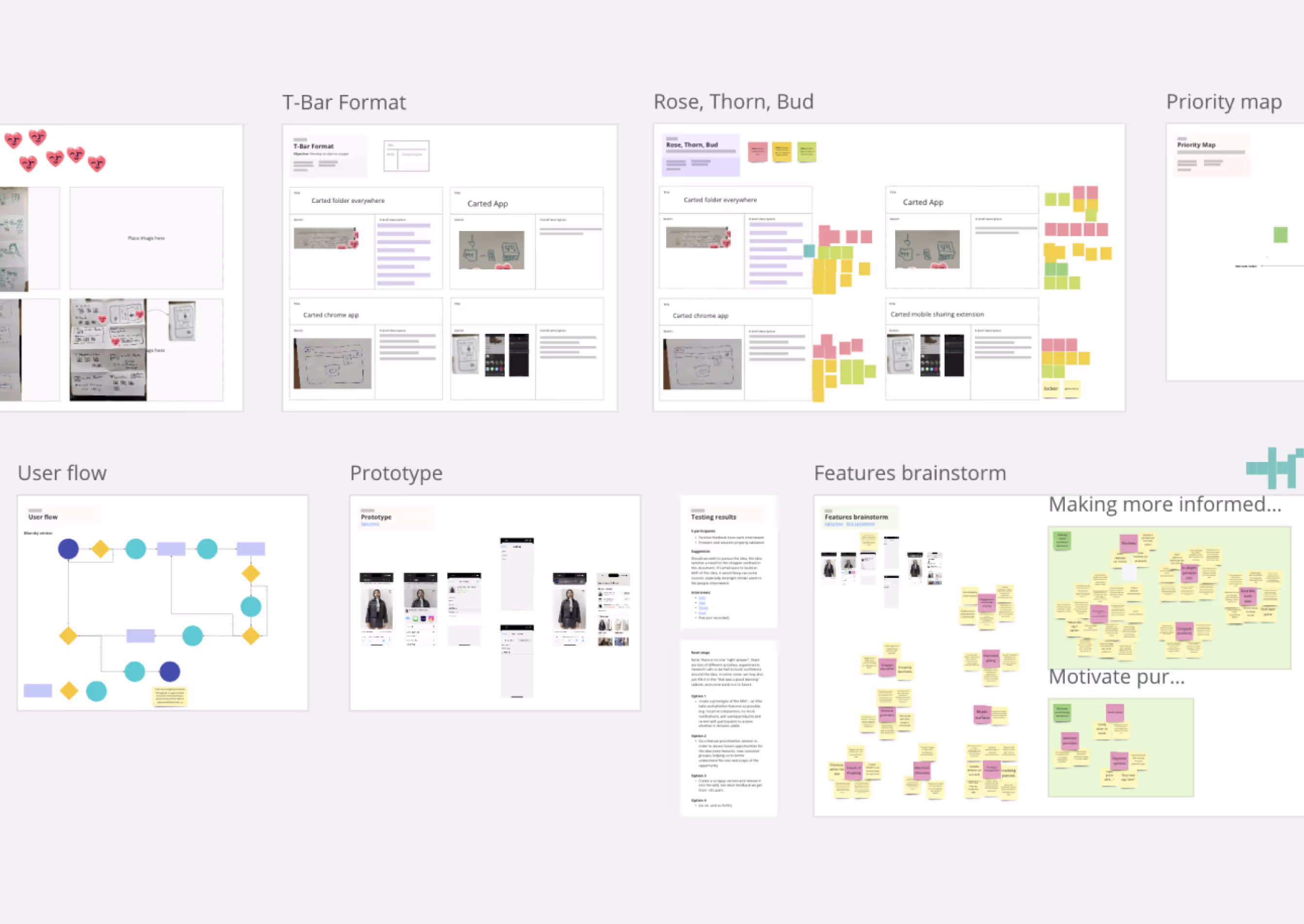
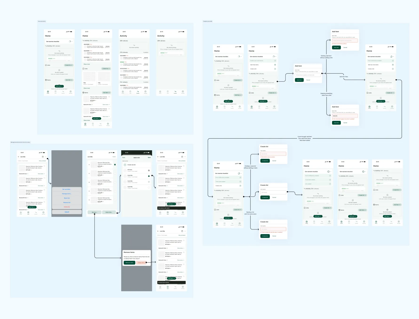
I then facilitated a design dash with six team members, using a number of workshop tools to generate a list of ideas.
The following day, I created a clickable prototype and tested them with five participants.
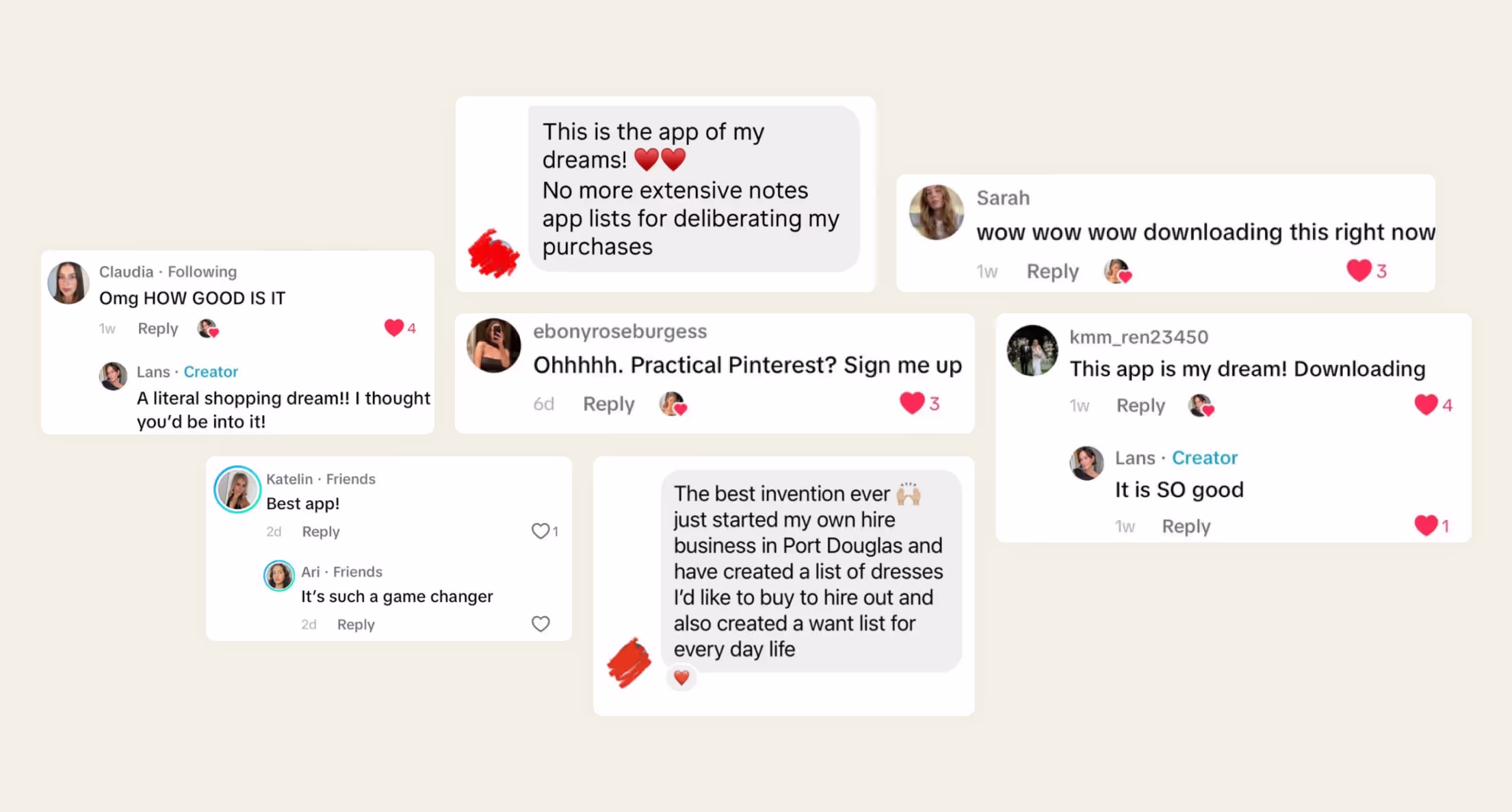
The response was overwhelmingly positive and the design dash deemed a success.
INto beta
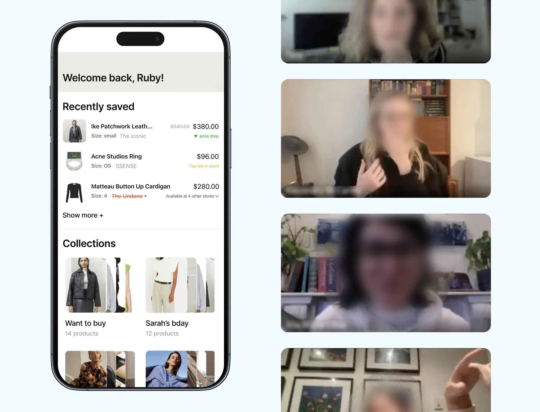
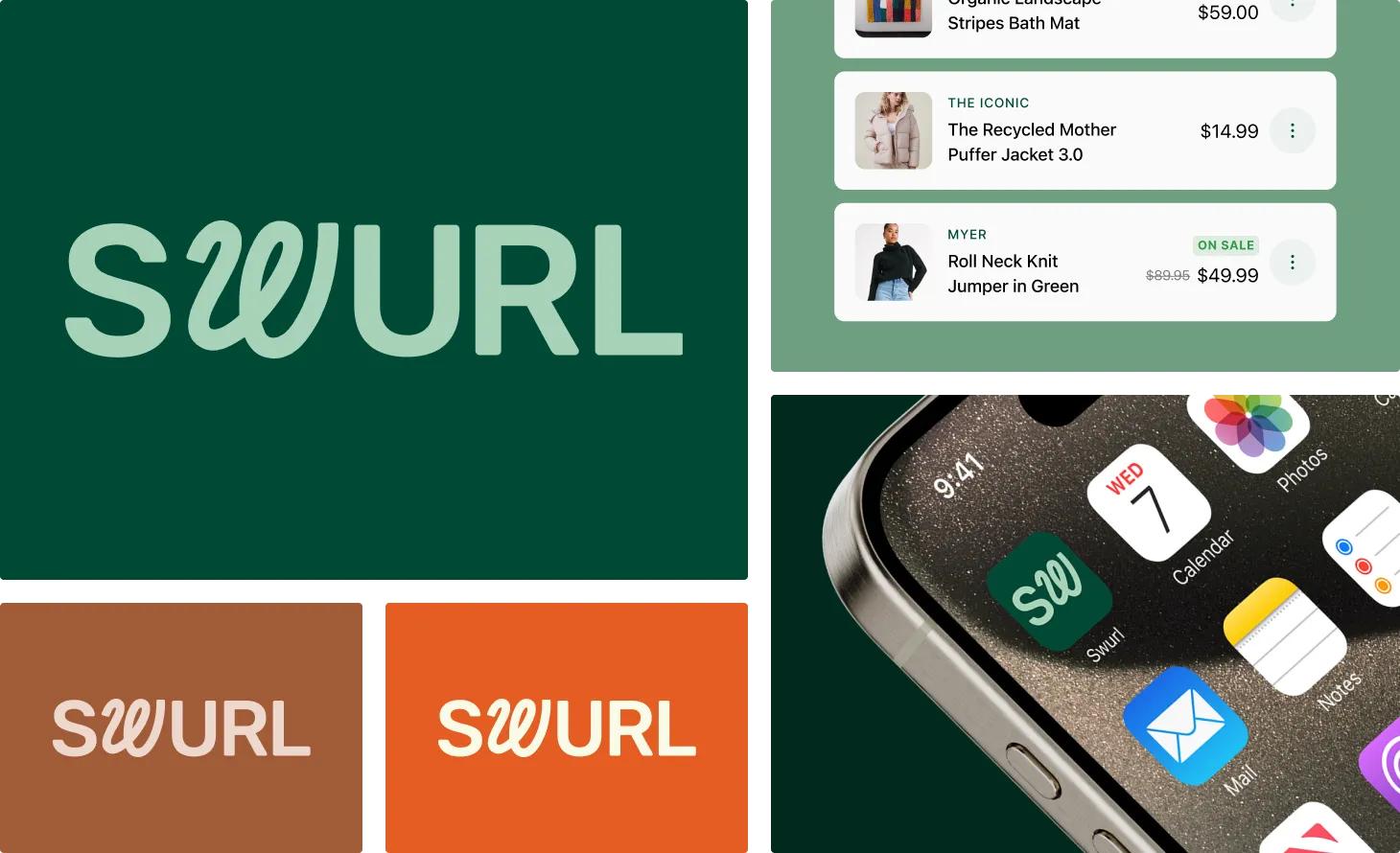
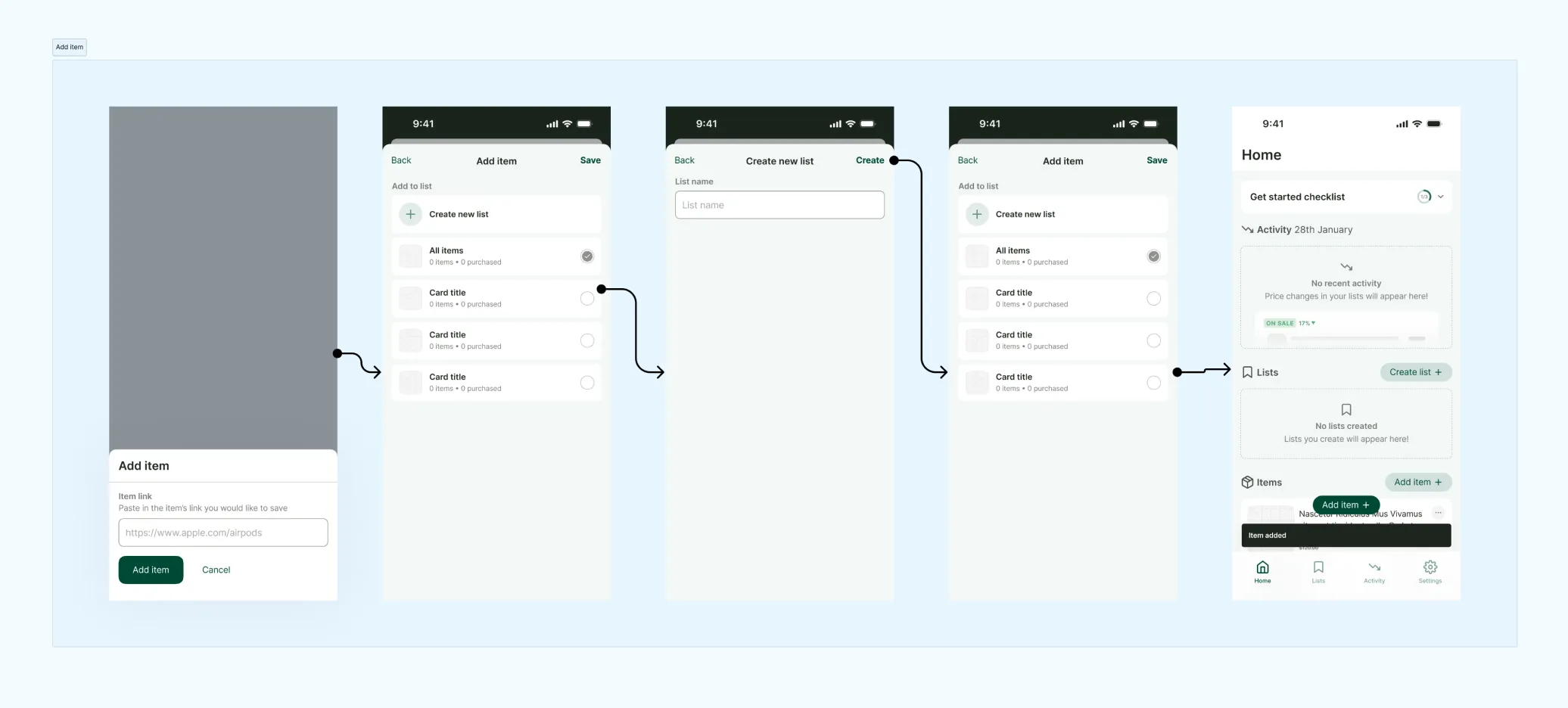
I set to work creating a minimum viable brand (MVB) – just enough to get us going and feel like a legitimate app but not getting bogged down in the details.
Within the week, we had an MVP of the product that fulfilled the objective of allowing shoppers to save products for later. The prototype was then released to 92 testers as part of the beta release.
During this time, we saw an average of 17 items saved per user, which given an initial hypothesis that if shoppers were saving more than one item and returning more than once, then this would be cause for continuing to the next stage. We smashed this metric.
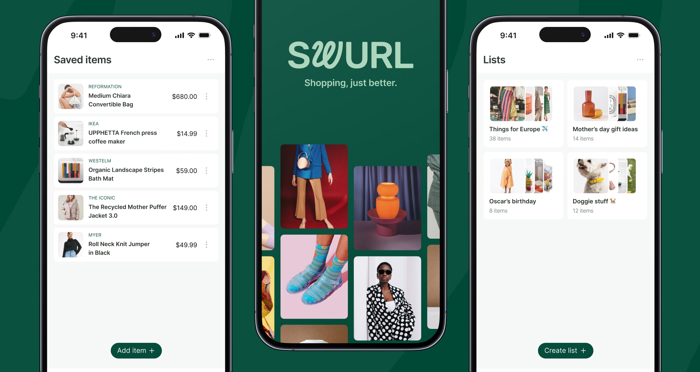
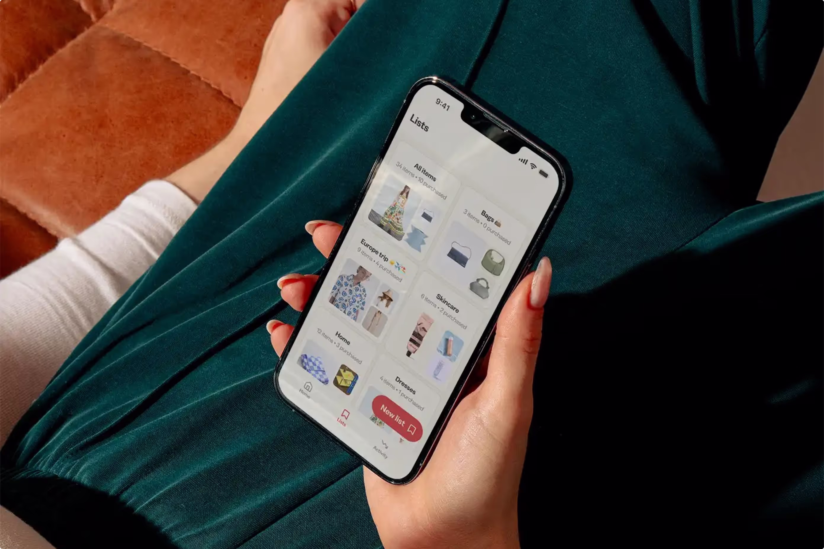
THe Finished app
The beta app was so successful that Carted (the parent company) transitioned the business toward providing Swurl as its primary product.
The app – now known as Carted – is now live in the Apple and Google app stores.